Design a Business Card-Sized Calendar That’s Readable
I love to make my own calendars. This challenge looks like something I would love to design:
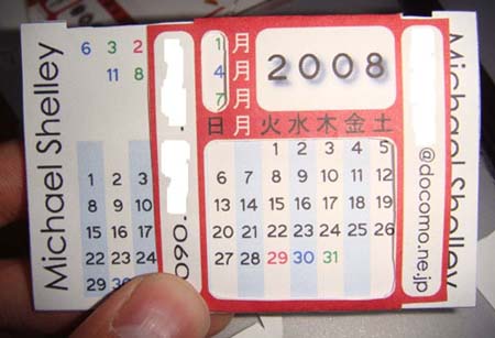
Of all the entrants, I like this calendar the best:

It doesn’t look quite right, mostly because I can’t read the language it’s in, but it looks ingenious. I’ll have to play around with it to see if I can make one that’s useful.
Via: Design challenge: design a business card-sized year-long calendar that doesn’t… (kottke.org)

Wow! That is cool! The symbols are just kanji. The vertical white one means “moon”, so it stands for month, and also for Monday. The others going across you can figure out from there (Sunday to the left of the moon symbol, Tuesday to the right, etc.) I never imagined a calendar where months could be consolidated like that. Ingenious is right!
Comment by Lillian — 11/27/2007 @ 6:51 am